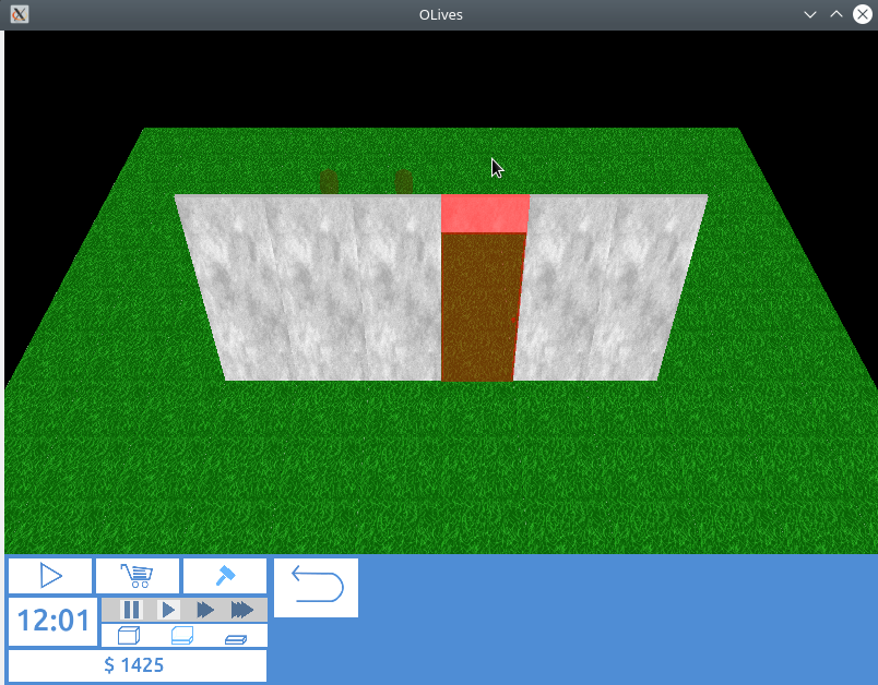
– Apply the same selection colour to the portals as the surrounding wall piece
– Re-work how selection states are shown on models (use the extra flags as opposed to piggy backing in another variable)
– When hiding portals altogether, do it in the vertex not the fragment shader
Now, when hovering over a portal (door/window) the same mechanisms are triggered as if the user was hovering over the surrounding wall.
Additionally, the hover state handling was improved quite a bit, so that the portal models now also reflect the current state. As the portals are drawn like any other model, these changes also affected how the object preview models are drawn – a nice side effect as how the selection state was brought to the shader was more than a little hacky until now.
Visually it does not look like much, but a nice improvement nevertheless, check it out below:
