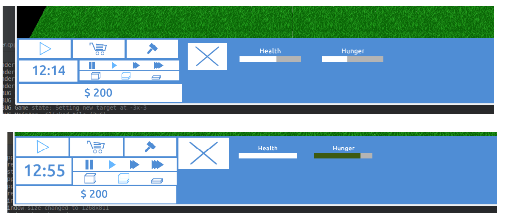
add new padding and sizing modes in order to allow for near pixel-perfect widget alignment
This took a while and was fairly frustrating. This is visually a considerably better result, but by no means perfect. It essentially tries to bring the concepts of “relative sizes” and “pixel specified sizes” closer together, but still suffers from some rounding problems. Be that as it may, it’s a clear improvement, as can be seen in this before/after shot:

